The Sketchbook Project

IMG_4017When I picked up this book – almost a year ago now! – I had no idea what I was getting myself into. And not that it had to be a big thing, but it turned into one. The Sketchbook Project, for those of you who don’t know, is an amazing collaborative, crowd-sourced art project where anyone can buy one of these little books, fill it with whatever they want, and then send it back in and it becomes part of this library that tours the country and then comes to rest at a storefront in Brooklyn where anyone can get a library card and then look at all these (33,000+) submissions! You can also view many of the sketchbooks online through their digital library. So cool, right?

IMG_0707Every submission year is kind of like a different cohort with a separate set of themes that artists can use to categorize their books. One of the themes this year was Parts of the Whole which really resonated with me and the style of art that I do – there are so many parts that I create individually in order to form a whole picture.
And then there’s my friend group, which has been a very solid urban family for the past 4+ years (and several people I’ve known since my portland days!) We took this great trip for Memorial Day last year, taking off 3 days of work (longer than I took off to go to Panama) in addition to Memorial Day to go to a lake house upstate. The picture I used is of all of us on a day we rented a pontoon boat in the rain, and our “captain” expertly maneuvered it to the dock connected to our house so that we could go in and wait out the worst of it. So, it’s all these little pieces of paper that make up the picture, and it’s all these wonderful people who make up this amazing group.

IMG_4019When conceptualizing it – I know that what I do is pretty far from sketching (and actually I really want to take a drawing class because I think my lack of self-originated creation skills are starting to hold me back) Instead of doing a different piece for each page, I wanted to do something sort of “sketchy” – showing the process and the work that went into the final. And also relates to the theme. So I kept all of the paper scraps from which I cut the individual pieces, in order to put them on all of the pages of the book leading up to the final page where the completed picture would be.

IMG_3751Some other decisions I didn’t make until I was in it – for instance, making each person a different color. This was honestly a defensive move because I’d never made a piece with so many people in it, and I wasn’t sure whether they would differentiate enough. Maybe next time I do something like this (will I ever?) I’ll just trust you’ll be able to tell what’s going on… we’ll see. Also the background being more-or-less black and white was a late decision, based mainly on the fact that as I was constructing it I was putting all the people on the original black-and-white print out of the photo and it looked pretty cool, and people were like “you should leave it like that!” which I wasn’t going to do. But I think it worked because it makes the people pop more.

IMG_3886

IMG_3887

IMG_3888

IMG_3890

IMG_3889

IMG_3891

IMG_3892Another last minute decision was to separate all the negative pieces by person and arrange them individually on the preceding pages. I sort of tried to have them start as completely abstract, and move slowly towards something somewhat recognizable as human by the end – or at least more forming something.

IMG_3626There were also a number of missteps along the way which, in hindsight, could have made for interesting inclusions (for instance, the pontoon boat was originally a bunch of different gold and metallic papers, as I have many of those, but it just didn’t read right and honestly had no place competing with my friends for visual attention, so I had to scrap that. And a couple of people’s faces or clothing articles were wrong and had to be switched out).

IMG_3814Anyway, after the many many days and nights of anti-social-ness (kind of ironic, seeing as it’s a project about my friends) I had the main piece done, and I had painstakingly saved all of the negative spaces from which all the pieces were cut. Then it was time to start thinking about assembly.

IMG_3826The book is 5″X7″ and there are 8 10″X7″ pages folded in half and stapled in the center. You’re allowed to dismantle the book and do whatever you want to it (as long as the final product fits back into the original dimensions) and I knew I didn’t want the final picture page to be split onto two half-pages, so I decided to take out all the pages and put them in more like a fan so all of them would be able to lie flat in the final. Also, because although I had so so many pieces of negative (and I’d also saved all the little tracing paper shapes I used to transfer the image from the photo to the paper), I didn’t think I had enough to fill up all both sides of all of the pages in the book. So I used only the front sides of each of the pages and then glued them to each other so that each page would lie flat and nothing would be cut in half.

IMG_3750And then there was gluing. Confession: I am not so great at actually constructing my art pieces. I make all the shapes, but then to connect them to one another, all the pieces are precariously held together with stingy pieces of masking tape. Then when it’s all assembled, I have to figure out how to make them stay like that and actually be a finished product. This is enough of a struggle for me when I’m making something to go in a frame on a wall and never be touched again, let alone making it to be handled by who-knows-how-many people!

IMG_3849Enter Mod Podge. I had heard of this stuff before, but shockingly never actually used it. My hope was that it was magic and could soak through all my layers of paper, binding them together without me having to really do anything, but I guess it doesn’t work that way. I also didn’t anticipate that it would make all the pages and pieces wrinkly. Maybe there’s a way to use it so it doesn’t? but anything I put the glue on started to curl, and the thinner papers curled almost to the point of unsalvageability, so that was challenging. And the pages started feeling like plastic, which I guess they partly were by the end.

IMG_3893There was the additional challenge of the pieces of paper that ended up in the creases, and figuring out how to get them to stick in such a way that they could fold up and lay flat. If you look closely at the arm of one of the people in the final, you can see that this got a little messed up.

IMG_4018Also I used a rubber stamp set for the dedication and info pages, and also for the title of the book (it’s the hashtag my friends put on all the pictures associated with our trip – we were staying near Caroga Lake) but because of the Mod Podge the ink didn’t dry, and smeared when I tried to put on another layer of glue, so I had to go back over it in sharpie. And then there was getting the pages to actually be in the cover, which I did by sewing them in with dental floss – I’d heard it was really strong! (Mint waxed, for the record)

Another learning curve was the whole abstract-art aspect of the negative space pages. Not something I’ve really ever done before, although I really do like abstract art, and I think there’s definite room for compositional improvement there! But it was fun, and a stretch. And sometimes I get a little tired of my art form and wonder whether it’s really art or just craft, and I think if it’s challenging and emotional then it definitely is, and this definitely was.

IMG_4020

The High Priestess

20140824-152107-55267315.jpgMy friend Bethany Jones is an amazing tarot reader – there have been a few crucial points during my time knowing her when her readings have helped me find clarity and peace – whether you believe that tarot is clairvoyant or just that it helps you look at whatever your situation from a new perspective.

Bethany has recently started a tarot business, Tarot by B, and I wanted to make her something to commemorate. Her favorite card is The High Priestess – partially because it has her initials, but also because it’s about intuition, which is at the heart of her life and her practice.

In making this card, I wanted to capture the abundance and splendor that I think exists in everyone’s center, and also because the High Priestess herself seems so royal and in a lush jungle of sorts, so I used a lot of gold, along with bright blue and red and sparkles. I put a muted flowered black frame around it to symbolize the outside, with intuition being a sort of treasure trove within or bright, warm respite from the dark.

20140824-154324-56604464.jpg

Blue Bird

20140803-152545-55545894.jpgNot sure what kind of bird this was originally, but it’s blue now! Made out of this velum origami paper that I picked up somewhere. I love animals and nature, branches especially. This one’s simple, but I think I’m gonna look for a big tree scene for a future project.

20140803-153600-56160294.jpg

Centered and Open

20140622-210024-75624958.jpgI’ve been making my way (albeit slowly) through The Artist’s Way, and it is such an incredible experience. It’s helped me become so much more in touch with myself and my instincts and energy, and certainly my creativity – highly, highly recommended to anyone even remotely interested!

One of the tasks this week was to create a mantra, write it using some sort of art product, and post it where you’ll see it every day. “Centered and open” is a mantra that I’ve had in my head for the past few months because those somewhat diametrically opposed forces are both ones that I’ve found I need to concentrate on to find balance. And often before leaving my apartment I will set an intention as to which force to focus on for that day – which needs more, given my headspace and whatever situation I’m walking into.

Anyway, word art – not typically my thing! But I wanted to represent the words in a way that also conveyed their meaning. So, yeah, the word “centered” centers around itself (or really it centers around the ampersand) and then from that center grows the word “open”. I decided to put it on my mirror which I definitely see every day, and you can also get a glimpse of the back of the paper, which I like because the front, the red, is intense and serious, like this setting of intention, but from that comes a light-hearted and easy way of moving through the world, like the flowers!

20140622-210026-75626462.jpg

20140622-210029-75629283.jpg

Girl in Shadows

20140612-123341.jpg

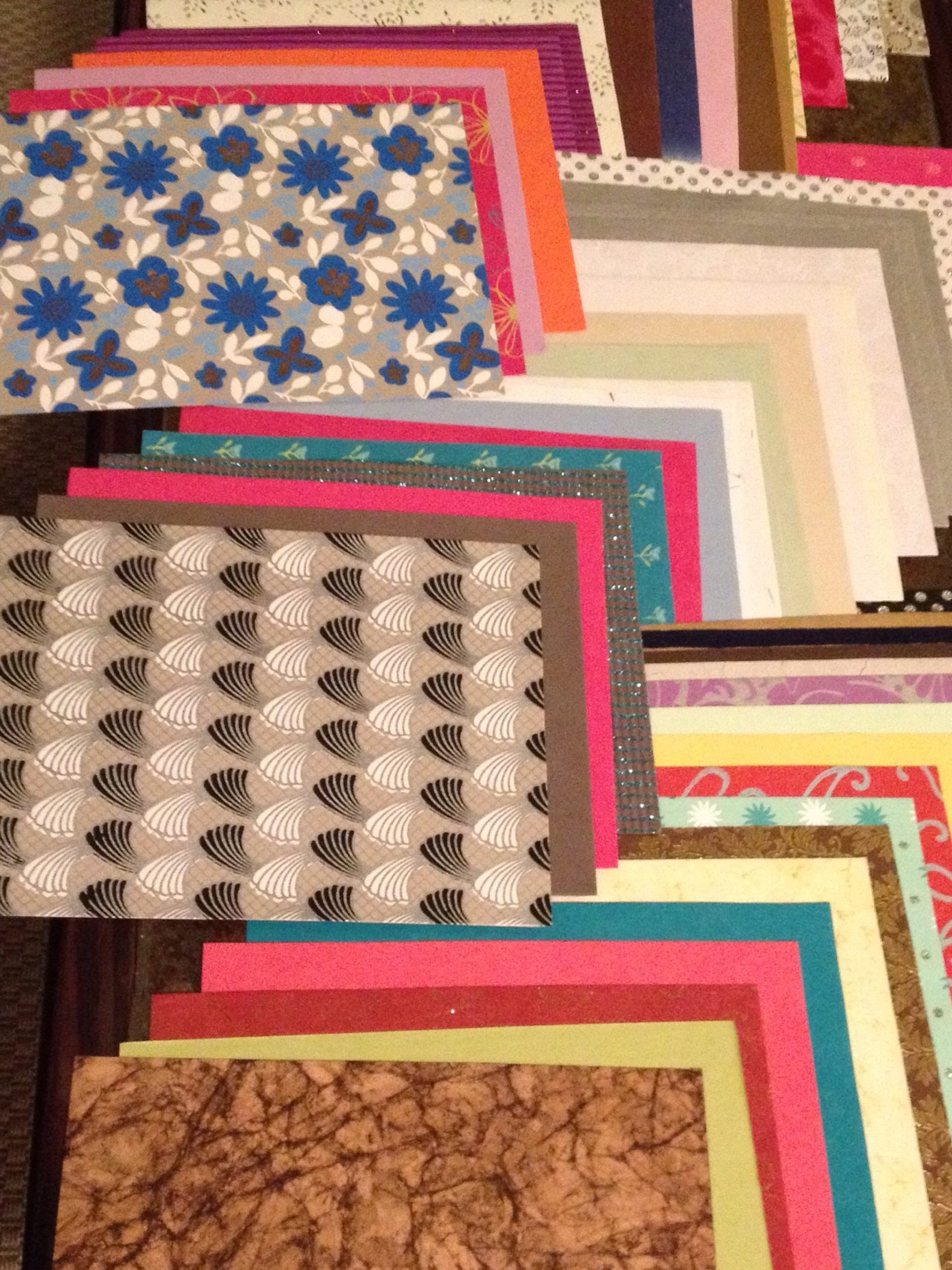
Wow, I’m so glad I decided to keep going with this piece! And I am so excited to start playing with shadow and depth going forward.

The paper I used for the shadows – the gold horses on black – is one I got a while ago and have been waiting for the right moment to use. I wasn’t sure how it would work with the other golds in the piece, and you can see I ended up changing her hair color because the old hair blended in too well. But yeah, I’m super pleased with the result! I also think just the shadow part on it’s own is cool.

20140612-123353.jpg

20140612-123401.jpg

20140612-123408.jpg

Girl in Green

20140601-153916.jpg

Young Girl in Green has been one of my favorite paintings ever since I ended up with a fold-out poster of her from some French magazine when I was 11. A few years ago, my brother got me a 1000-piece puzzle of her that I spent the entire Sandy hurricane putting together. And recently I tried to reproduce her through my paper art.

I don’t know that this is a finished piece. I think I might want to go back in and add all the shadows – there’s so much depth that I’ve lost. But I do like her like this too, so we’ll see.

Also it’s quite a challenge for me to work from a painting – it feels similar somehow to the piece I did of my brother’s dog where I had to decide how to treat the shading – at what point does the gradient descend so far into black that I should no longer represent it with color? Anyway, this was a first attempt.

20140601-154110.jpg

The Triptych

20140518-162644.jpg

Two things:
1) There’s that phenomenon whereby as soon as you learn a word you start hearing it everywhere. Well, the same day that I learned what a triptych was during my visit to the Cloisters, where there are many, I was asked to make a triptych of girls with guns
2) My friend was totally right about that whole appealing to the male demographic thing

20140518-162801.jpg

20140518-162810.jpg

20140518-162819.jpg

Ballerina Trio

20140504-170903.jpg

I love ballet, and watching stories come alive through beautiful movement. Also the incredible shapes the dancers make, and what they’re capable of doing – it looks unreal, especially when they’re paper cut-outs instead of photographs. To me, totally mesmerizing.

20140504-170916.jpg

20140504-170932.jpg

20140504-170948.jpg

Piece of my Heart Project

20140420-175236.jpg

I’ve been discovering the power art has to help process change. This project was about people with whom I went through a lot, and didn’t come out the other side, but who are still in my heart. I wanted to be able to let the heaviness of those past relationships go, and refocus my memories on when we were at our happiest.

20140420-175244.jpg

20140420-175252.jpg

20140420-175259.jpg

ARTemis

20140413-133908.jpg

My brother probably asked me for a portrait of his dog, Artemis, like a year ago, or even longer, and I just got it to him last week. It was an interesting project because dogs don’t wear clothes or have hair (or really they don’t have skin), and typically that’s what I use to differentiate between colors. So for this I did blackish for black, whitish for white, and then purple for highlights? (it made sense in my head)

20140413-134305.jpg

Enter your email address to follow this blog and receive notifications of new posts by email.