The Sketchbook Project

IMG_4017When I picked up this book – almost a year ago now! – I had no idea what I was getting myself into. And not that it had to be a big thing, but it turned into one. The Sketchbook Project, for those of you who don’t know, is an amazing collaborative, crowd-sourced art project where anyone can buy one of these little books, fill it with whatever they want, and then send it back in and it becomes part of this library that tours the country and then comes to rest at a storefront in Brooklyn where anyone can get a library card and then look at all these (33,000+) submissions! You can also view many of the sketchbooks online through their digital library. So cool, right?

IMG_0707Every submission year is kind of like a different cohort with a separate set of themes that artists can use to categorize their books. One of the themes this year was Parts of the Whole which really resonated with me and the style of art that I do – there are so many parts that I create individually in order to form a whole picture.
And then there’s my friend group, which has been a very solid urban family for the past 4+ years (and several people I’ve known since my portland days!) We took this great trip for Memorial Day last year, taking off 3 days of work (longer than I took off to go to Panama) in addition to Memorial Day to go to a lake house upstate. The picture I used is of all of us on a day we rented a pontoon boat in the rain, and our “captain” expertly maneuvered it to the dock connected to our house so that we could go in and wait out the worst of it. So, it’s all these little pieces of paper that make up the picture, and it’s all these wonderful people who make up this amazing group.

IMG_4019When conceptualizing it – I know that what I do is pretty far from sketching (and actually I really want to take a drawing class because I think my lack of self-originated creation skills are starting to hold me back) Instead of doing a different piece for each page, I wanted to do something sort of “sketchy” – showing the process and the work that went into the final. And also relates to the theme. So I kept all of the paper scraps from which I cut the individual pieces, in order to put them on all of the pages of the book leading up to the final page where the completed picture would be.

IMG_3751Some other decisions I didn’t make until I was in it – for instance, making each person a different color. This was honestly a defensive move because I’d never made a piece with so many people in it, and I wasn’t sure whether they would differentiate enough. Maybe next time I do something like this (will I ever?) I’ll just trust you’ll be able to tell what’s going on… we’ll see. Also the background being more-or-less black and white was a late decision, based mainly on the fact that as I was constructing it I was putting all the people on the original black-and-white print out of the photo and it looked pretty cool, and people were like “you should leave it like that!” which I wasn’t going to do. But I think it worked because it makes the people pop more.

IMG_3886

IMG_3887

IMG_3888

IMG_3890

IMG_3889

IMG_3891

IMG_3892Another last minute decision was to separate all the negative pieces by person and arrange them individually on the preceding pages. I sort of tried to have them start as completely abstract, and move slowly towards something somewhat recognizable as human by the end – or at least more forming something.

IMG_3626There were also a number of missteps along the way which, in hindsight, could have made for interesting inclusions (for instance, the pontoon boat was originally a bunch of different gold and metallic papers, as I have many of those, but it just didn’t read right and honestly had no place competing with my friends for visual attention, so I had to scrap that. And a couple of people’s faces or clothing articles were wrong and had to be switched out).

IMG_3814Anyway, after the many many days and nights of anti-social-ness (kind of ironic, seeing as it’s a project about my friends) I had the main piece done, and I had painstakingly saved all of the negative spaces from which all the pieces were cut. Then it was time to start thinking about assembly.

IMG_3826The book is 5″X7″ and there are 8 10″X7″ pages folded in half and stapled in the center. You’re allowed to dismantle the book and do whatever you want to it (as long as the final product fits back into the original dimensions) and I knew I didn’t want the final picture page to be split onto two half-pages, so I decided to take out all the pages and put them in more like a fan so all of them would be able to lie flat in the final. Also, because although I had so so many pieces of negative (and I’d also saved all the little tracing paper shapes I used to transfer the image from the photo to the paper), I didn’t think I had enough to fill up all both sides of all of the pages in the book. So I used only the front sides of each of the pages and then glued them to each other so that each page would lie flat and nothing would be cut in half.

IMG_3750And then there was gluing. Confession: I am not so great at actually constructing my art pieces. I make all the shapes, but then to connect them to one another, all the pieces are precariously held together with stingy pieces of masking tape. Then when it’s all assembled, I have to figure out how to make them stay like that and actually be a finished product. This is enough of a struggle for me when I’m making something to go in a frame on a wall and never be touched again, let alone making it to be handled by who-knows-how-many people!

IMG_3849Enter Mod Podge. I had heard of this stuff before, but shockingly never actually used it. My hope was that it was magic and could soak through all my layers of paper, binding them together without me having to really do anything, but I guess it doesn’t work that way. I also didn’t anticipate that it would make all the pages and pieces wrinkly. Maybe there’s a way to use it so it doesn’t? but anything I put the glue on started to curl, and the thinner papers curled almost to the point of unsalvageability, so that was challenging. And the pages started feeling like plastic, which I guess they partly were by the end.

IMG_3893There was the additional challenge of the pieces of paper that ended up in the creases, and figuring out how to get them to stick in such a way that they could fold up and lay flat. If you look closely at the arm of one of the people in the final, you can see that this got a little messed up.

IMG_4018Also I used a rubber stamp set for the dedication and info pages, and also for the title of the book (it’s the hashtag my friends put on all the pictures associated with our trip – we were staying near Caroga Lake) but because of the Mod Podge the ink didn’t dry, and smeared when I tried to put on another layer of glue, so I had to go back over it in sharpie. And then there was getting the pages to actually be in the cover, which I did by sewing them in with dental floss – I’d heard it was really strong! (Mint waxed, for the record)

Another learning curve was the whole abstract-art aspect of the negative space pages. Not something I’ve really ever done before, although I really do like abstract art, and I think there’s definite room for compositional improvement there! But it was fun, and a stretch. And sometimes I get a little tired of my art form and wonder whether it’s really art or just craft, and I think if it’s challenging and emotional then it definitely is, and this definitely was.

IMG_4020

Ballerina Trio

20140504-170903.jpg

I love ballet, and watching stories come alive through beautiful movement. Also the incredible shapes the dancers make, and what they’re capable of doing – it looks unreal, especially when they’re paper cut-outs instead of photographs. To me, totally mesmerizing.

20140504-170916.jpg

20140504-170932.jpg

20140504-170948.jpg

The Monochromes

20140330-114108.jpg

I’m not sure if you’re allowed to have your favorite color be gold, but if you are, mine is. In tribute, and because I realized that over the years I’ve collected quite a few papers in the gold family, and potentially also because it won’t stop being cloudy here which makes everything kind of muted anyway, I decided to spend some time working with just those. I don’t think I’m totally over it yet, but here are the four completed:

20140330-114240.jpgThe Nude
The sepia/beige color palate on this one gives her an innocence and coyness that definitely wasn’t in the original photo, where the model was wearing shiny purple panties.

20140330-114515.jpg Yoga in Gold
I love yoga poses because they’re so beautiful all on their own. With this one, I tried to use the gold reeds of her skin to symbolize the strength and energy flow through her body.

20140330-114736.jpg Babe in Boots
There’s a lot of gold in this one, even flecks in her skin, which I’m not sure we’re picked up by my amazing camera phone, but the boots steal the show – as they should.

20140330-115057.jpg The Mermaid
Mermaids are such ethereal creatures, and so doing her all in gold seemed especially fitting, and a nice contrast with the sea blue and green of the matting and frame.

Also! I have finally started an Etsy store!! So if you’re interested in any of these pieces, or to see what else I have available, visit art by raealize on etsy!

Body vs. Clothes

20140302-125821.jpg

Both of the original photos for these women had them in dark, drab colors, and I started thinking about the things we can change about ourselves, and the things we can’t. You can change your clothes and hair, but you can’t really change much about your skin, and it’s certainly a process if you want to change your aura.

For this girl, I decided to change all her clothes to be bright and colorful, but her skin I wanted to be duller and more pensive – filled with small sepia type like someone who is totally in her own head. I also used the stripes for her hair because even though I wanted it to be colorful, I still wanted it to be limp and stringy.

20140302-125836.jpg

20140302-131010.jpgAlso can I just say that I made 4 pairs of shoes for this girl before I found ones I liked? High maintenance and indecisive, just like I created her to be, haha. Also, if anyone knows of shoes like the bee ones in real life, please let me know!!

20140302-130018.jpg
For this girl, I decided to keep the dark clothes, contrasted with her light hair and skin. But I felt a sense of calm and peace that I wanted to capture with her skin, and I also think it captures the tattoos. This is definitely more of a literal translation than I generally go for, but I kind of like it.

20140302-130359.jpg

20140302-130956.jpg

Girl with a Gun

20131230-223053.jpg

A friend told me he liked my art, but that he thought it would really only appeal to chicks (which wasn’t the first time I’d heard that).  He said if I wanted to make something for dudes it would have to be a girl holding a gun or something.  Done.

20131230-223106.jpg

Pregnant Jen

20131103-080845.jpg

A darling friend of mine from Portland was pregnant and had this beautiful photo series done with her husband. I’m not sure exactly how I decided to use one of her images to make a portrait, but I think it might have originated in a facebook comment conversation based on some of my other pieces. Anyway, portraits of people I know are awesome, and I want to do more of them. So cool to think about the person who I’m creating it for when choosing the photo and the papers. I chose the reindeer paper for Jen’s skin because I thought about her creating life within her, and the energy of it seemed appropriate.

20131103-080911.jpg

Religious Propaganda Girl

20130924-105046.jpg
For years I liked collecting what I call religious propaganda, which basically refers to anything faith-based that someone is handing out on the street, and other things like glow-in-the-dark Mary candles and Bibleopoly (actually kind of a fun game). I decided to use the handouts to recreate the Brooklyn Girls Baywatch Babe. Not sure it worked that well because the whole point is the contrast between the papers, and it’s also such small pieces that you can’t really tell what’s written on it, but it was a fun project nonetheless.

20130924-105122.jpg

Brooklyn Girls

20130912-152917.jpg
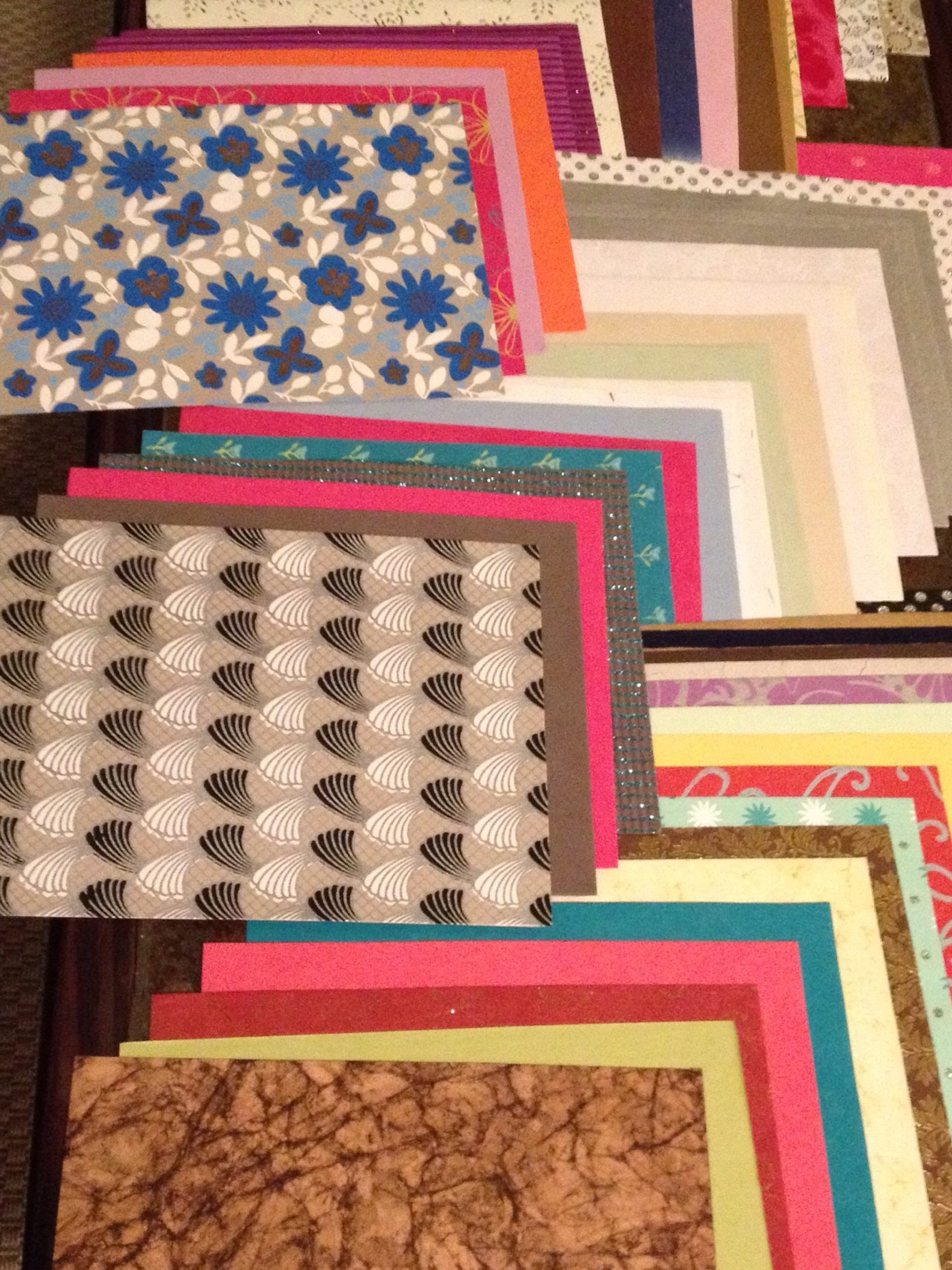
I’ve always been into making collages with magazines, and then at some point started getting into scrapbooking paper. This was back when I was living in Portland. One of my roommates at the time worked at a bookstore, and when they had calendars that didn’t sell, they would rip off the cover to send back to the publisher, and then they could do what they wanted with the rest of the calendar. One of these that made its way back to our house was the Brooklyn Girls calendar, where queer girls from Brooklyn dressed up as pinups from the different decades. We didn’t love the way they looked as such (no offense) but another roommate suggested I remake the girls with scrapbooking paper, and thus my art form was born!

20130923-135132.jpg

20130923-135202.jpg

20130923-135149.jpg

20130923-135212.jpg

20130923-135223.jpg

20130923-135235.jpg

Enter your email address to follow this blog and receive notifications of new posts by email.